Monday, July 20, 2009

A New Assignment


So I've been hankering for a new assignment that has distinct flavors of design with a lot of fun illustration opportunities, a wallop of spicy heat. As I was finishing off the last hard cider in my fridge, it dawned on me....why not redesign a six pack? Now that I am 21, have access to a car, and the variety of local Boston brews are readily accessible, I've been scouting out the cool labels and looking for a new favorite. (No surprise,...not much out there has tickled my fancy and I think we could do WAY better.) I say, let's rev up our lazy summer days, drink a six pack and design some kickass labels and packaging for funzies.

This would be all typographic (think red stripe), all illustration (think fat tire), or a combination of both (mike's hard lemonade.) Feel free to take on anything from Schlafly, to Budweiser, to Sam Adams, to organic whole foods sarsaparilla. Whatever you like, it's YOUR summer.

Deadlines:
Monday July 27th: Present your favorite idea with sketches + two backups to the blog. Comments ensue.
Monday August 3rd: Present 1st iteration of label + beginnings of six-pack carton.
Friday August 14th: Project Due (and portfolio ready!)

Who's with me. I bet Amini is! Let's all also try to get some more people on board. Where the heck is Jenny anyway?

Saturday, July 4, 2009

STAY OFF MY LAWN


I understand that this is severely late.

Hoever, I would like to point out that I used this as a learning opportunity on practicing with traditional and digital media. I hope to have a more in depth examination of the piece on my blog soon- but in the meantime.....here you go : P

Wednesday, June 24, 2009

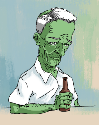
At least I'll still have a hobby when I'm 85


I went a little crazy with the lines here. I'm getting back into practice with my nib. The line weight can be really hard to control even though I like the sharpness and the organic nature of the line. It's fun to see myself old,....the way I'd like to be....crazy hair and all!

Monday, June 22, 2009

Pincushion v3


Alright...here's my third iteration of my Etsy identity. I've enjoyed your comments and tried to follow their suggestions. I tried to do three banners with simple changes ranging from really subtle to less subtle...I'm kinda fond of the middle one. Thoughts?

Sunday, June 21, 2009

Let's be clear: I won't be alive in 76 years...

Pictured above: Wishful thinking.

...but if I am, maybe I'll look something like this. Over at Drawn!, somebody posted a challenge to draw yourself at 100. People approach it from different directions, playing with varying degrees of caricature and, for lack of a better word, realism: the human face changes somewhat predictably with age. Burne Hogarth has a fantastic book, Drawing the Human Head, with a chapter that helpfully explains the process of how you will start to look like the Crypt-Keeper. Apparently, I have ignored the part of the text that describes how little hair you'll have left. So sue me.

The other thing about this particular doodle is that I tried some new tricks I've been toying with: the inking was done digitally on a tablet in Flash, and the painterly effects were an experiment in Photoshop to keep it from looking too flat. Any thoughts?

Let's see some old people! I'd love to see everyone else's wishful thinking.

Friday, June 19, 2009

Etsy try 2


Silly me, they were in CMYK,...that's why the colors were messed up. Thanks for the feedback Amina!

Thursday, June 18, 2009

Etsy Store

Hey guys:

So I'm trying to start my own Etsy store and a lot of the names I wanted for it are already taken. I'm deciding between Pincushion Crafts and Echo Crafts and I want to make a banner for the store. If you know me, you know that I can't make a decision all that well without getting my studiomates opinions. Feedback? Pretty please?


So those colors are supa nasty so I'll upload some in black and white...or not. The black and white images aren't showing up,....this ever happened to you using blogger before? Well,...no luck tonight. I'll try again later.