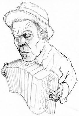
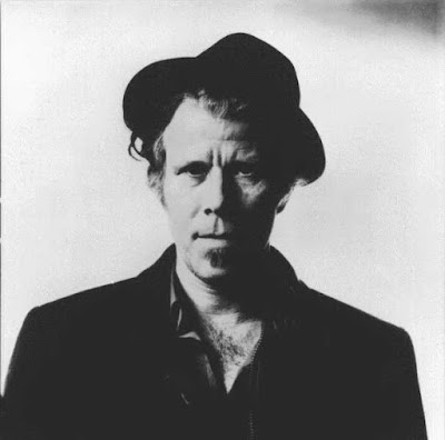
The art of capturing likenesses is a frustrating one, to be sure, but it's also a big part of drawing for a living. John once told us a story about how, with approximatey eight likenesses to do for a job, he churned out the final sketches for all but one in a day: Gwenyth Paltrow, however, took forever. Looking at Gwenyth, she has no unique or offensive features, is thin and blonde, and has no props with which she is frequently associated. She is, in short, a nightmare to draw. Tom Waits does not present this problem. Not at any level.

I went through a few sketches that missed the mark before I got close. My inclination to make his craggy face more angular was steering me wrong.
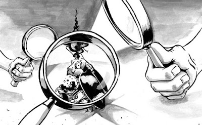
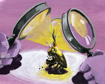
 ...and the "finished" product. I wanted leave tons of white on his face, and keep everything else in the drawing very simple and stark. The value of the purplish tone is a little too dark, but scooting around too much photoshop negatively affected the rest of it. All in all, I'm pretty happy with it. Thoughts?
In approximately two weeks, you'll all start scattering far and wide, so let's rev this thing up again. Come late August, when surely you'll all be desperate to return to studio for another year, this is closest you'll have. I may be a year late, but I'm still working through these assignments. What about you all?


