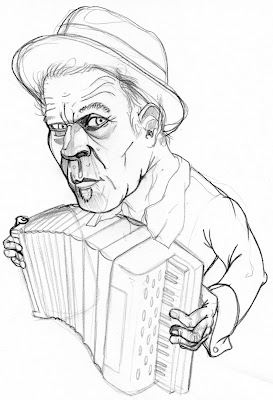
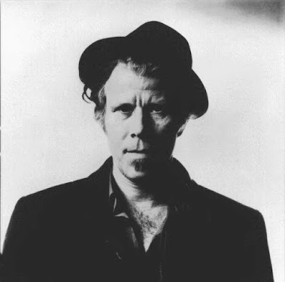
The art of capturing likenesses is a frustrating one, to be sure, but it's also a big part of drawing for a living. John once told us a story about how, with approximatey eight likenesses to do for a job, he churned out the final sketches for all but one in a day: Gwenyth Paltrow, however, took forever. Looking at Gwenyth, she has no unique or offensive features, is thin and blonde, and has no props with which she is frequently associated. She is, in short, a nightmare to draw. Tom Waits does not present this problem. Not at any level.

I went through a few sketches that missed the mark before I got close. My inclination to make his craggy face more angular was steering me wrong.
 ...and the "finished" product. I wanted leave tons of white on his face, and keep everything else in the drawing very simple and stark. The value of the purplish tone is a little too dark, but scooting around too much photoshop negatively affected the rest of it. All in all, I'm pretty happy with it. Thoughts?
In approximately two weeks, you'll all start scattering far and wide, so let's rev this thing up again. Come late August, when surely you'll all be desperate to return to studio for another year, this is closest you'll have. I may be a year late, but I'm still working through these assignments. What about you all?

3 comments:
Mike, this is aws (ome)! I think it was a good impulse to show restraint in terms of color... The illustration shows a good sense of when to really pull something forward and make it important, and when something can sit back (aka, simple black shapes vs. detailed line work in the face). Good work
nice sophistication indeed sir, and an interesting switch from the gauche.
yea lets keep this thing up, why not? could be fun
I like it a lot, the simplicity is striking and in keeping with Waits' style.
I am all for starting up the studio again, but I would like to suggest a name change. Summer Studio seems a little flippant. How about "Wintery-Economic-Climate Studio"?
I'm kidding. But seriously, I think a revival would be good for all of us, even if there aren't official assignments, we can always profit from a little group feedback on our work and revisions.
Post a Comment